Migrating web layout from Bootstrap to CSS Grid
Last updated
Antonio Ufano
CSS Grid is here. With the last versions of the main browsers supporting it, it's very likely that will become one of the most popular ways to structure the content of the web. In this article I'm going to explain how to migrate a simple web template (header, two columns for menu and main content and footer) from Bootstrap, one of the most popular frameworks, to CSS Grid. The results will be identical but the CSS Grid one will give use more flexibility to position our content. You can find all files of this article in the following repository. Let's dig into it!\r\n\r\n## The Bootstrap template \r\n\r\nI've been using Bootstrap for some time and I love it. It's mobile first, completely responsive and very accessible as it's not very difficult to learn. In addition, its documentation is very helpful and you can find examples of anything you need on the web. It has some bad things though: it requires additional Javascript libraries (v4 requires jQuery and Popper) and if you just want a simple layout system, it can be a little heavy.\r\n\r\nLets say we have the below template, with three sections: header, main (with a column for the menu and another one for the content) and footer:
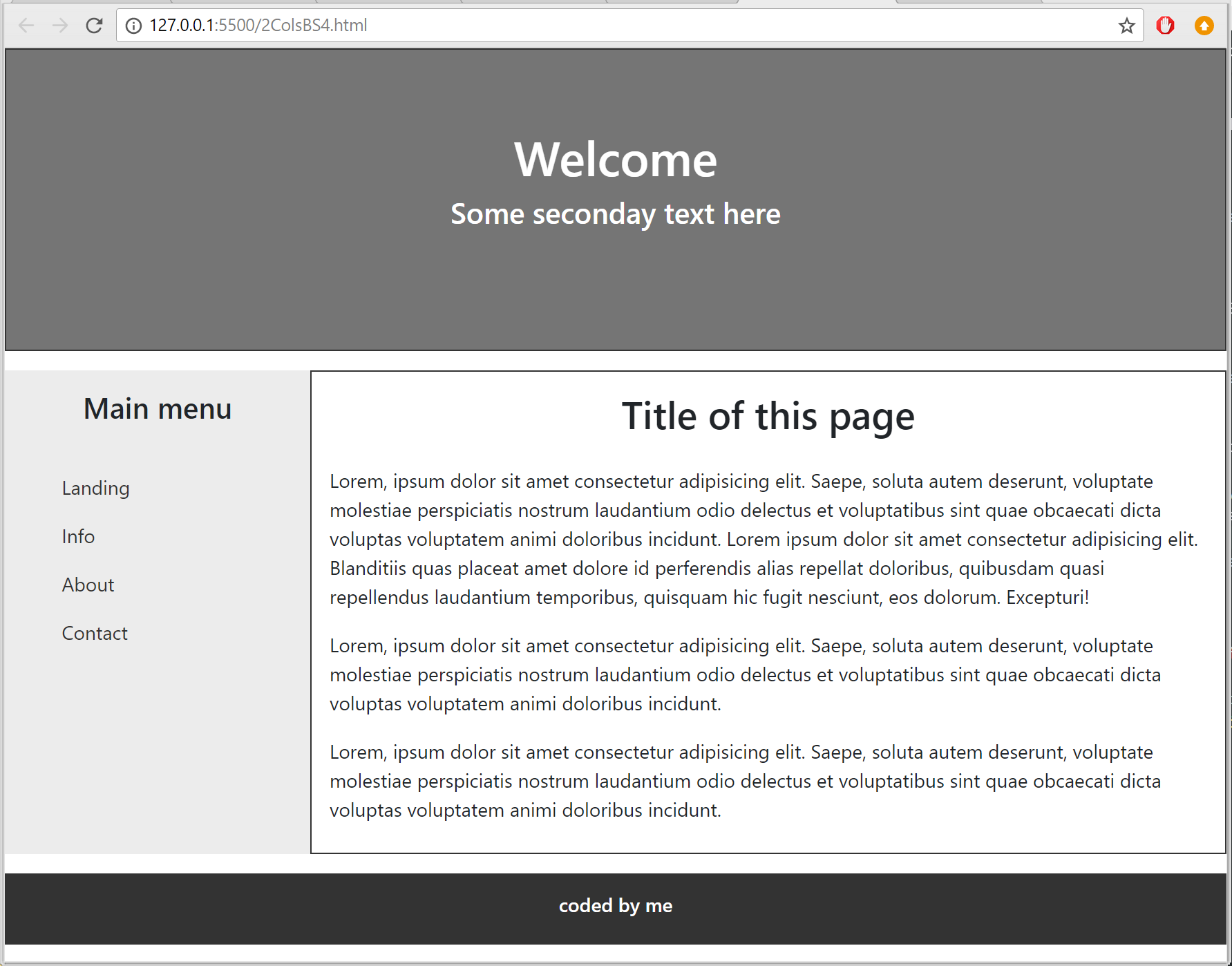
In order to build this with Bootstrap, we'll wrap the whole page in a .container div and then create the .row divs. Inside each row, we'll have to create the .col-xx-xx divs that will actually have the content of each section. This would be the body of our page:
<div class="container-fluid">
  <header class="row">
    <div class="col-md-12" id="head">
      <h1>Welcome</h1>
      <h4>Some seconday text here</h4>
    </div>
  </header>
  <div class="row">
    <aside class="col-md-3" id="menu">
      <h4>Main menu</h4>
      <nav class="nav navbar">
        <ul class="list-unstyled">
          <li><a class="nav-link" href="#">Landing</a></li>
          <li><a class="nav-link" href="#">Info</a></li>
          <li><a class="nav-link" href="#">About</a></li>
          <li><a class="nav-link" href="#">Contact</a></li>
        </ul>
      </nav>
    </aside>
    <main class="col-md-9" id="content">
      <h2>Title of this page</h2>
      <p>Lorem, ipsum dolor sit amet consectetur adipisicing elit. Saepe, soluta autem deserunt, voluptate molestiae
        perspiciatis nostrum laudantium odio delectus et voluptatibus sint quae obcaecati dicta voluptas voluptatem
        animi doloribus incidunt. Lorem ipsum dolor sit amet consectetur adipisicing elit. Blanditiis quas placeat amet
        dolore id perferendis alias repellat doloribus, quibusdam quasi repellendus laudantium temporibus, quisquam hic
        fugit nesciunt, eos dolorum. Excepturi!</p>
      <p>Lorem, ipsum dolor sit amet consectetur adipisicing elit. Saepe, soluta autem deserunt, voluptate molestiae
        perspiciatis nostrum laudantium odio delectus et voluptatibus sint quae obcaecati dicta voluptas voluptatem
        animi doloribus incidunt.</p>
      <p>Lorem, ipsum dolor sit amet consectetur adipisicing elit. Saepe, soluta autem deserunt, voluptate molestiae
        perspiciatis nostrum laudantium odio delectus et voluptatibus sint quae obcaecati dicta voluptas voluptatem
        animi doloribus incidunt.</p>
    </main>
  </div>
  <footer class="row">
    <div class="col-md-12" id="foot">
      <h6>coded by me<h6>
    </div>
  </footer>
</div>
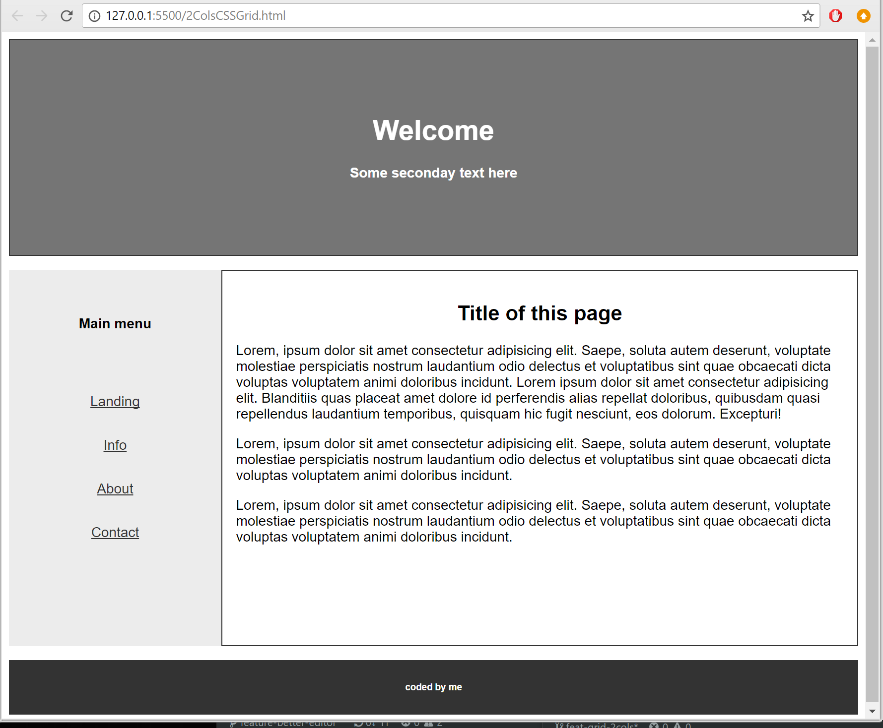
The CSS Grid template
With CSS Grid we'll also need to wrap the page in a div that will contain our grid and then just one div for each section of the page. You can see the code below:
<!DOCTYPE html>
<html lang="en">
<head>
    <meta charset="UTF-8">
    <meta name="viewport" content="width=device-width, initial-scale=1.0">
    <meta http-equiv="X-UA-Compatible" content="ie=edge">
    <!-- Own styles -->
    <link href="/css/2ColsCSSGrid_style.css" rel="stylesheet">

    <title>CSSGrid 2Cols template</title>
</head>
<body>
    <div class="site">
        <header id="head">
          <h1>Welcome</h1>
          <h4>Some seconday text here</h4>
        </header>
        <aside id="menu">
            <h4>Main menu</h4>
            <nav>
                <ul>
                    <li><a href="#">Landing</a></li>
                    <li><a href="#">Info</a></li>
                    <li><a href="#">About</a></li>
                    <li><a href="#">Contact</a></li>
                </ul>
            </nav>
        </aside>
        <main id="content">
            <h2>Title of this page</h2>
            <p>Lorem, ipsum dolor sit amet consectetur adipisicing elit. Saepe, soluta autem deserunt, voluptate molestiae perspiciatis nostrum laudantium odio delectus et voluptatibus sint quae obcaecati dicta voluptas voluptatem animi doloribus incidunt. Lorem ipsum dolor sit amet consectetur adipisicing elit. Blanditiis quas placeat amet dolore id perferendis alias repellat doloribus, quibusdam quasi repellendus laudantium temporibus, quisquam hic fugit nesciunt, eos dolorum. Excepturi!</p>
            <p>Lorem, ipsum dolor sit amet consectetur adipisicing elit. Saepe, soluta autem deserunt, voluptate molestiae perspiciatis nostrum laudantium odio delectus et voluptatibus sint quae obcaecati dicta voluptas voluptatem animi doloribus incidunt.</p>
            <p>Lorem, ipsum dolor sit amet consectetur adipisicing elit. Saepe, soluta autem deserunt, voluptate molestiae perspiciatis nostrum laudantium odio delectus et voluptatibus sint quae obcaecati dicta voluptas voluptatem animi doloribus incidunt.</p>
        </main>
        <footer id="foot">
          <h6>coded by me<h6>
        </footer>
    </div>
</html>
Now we have to define some CSS properties to the wrapper div (I gave it the class .site) so it will work as our grid. The first one is "display:grid" and the second one is "grid-template-areas". This second is the magic one 😉 Using the same template we defined above, we can say our grid will have three rows, head, main and footer, and two columns as the main row will be divided in the menu and the content section. With this in mind, we can define our wrapper like this:
.site {
  display: grid;
  grid-template-areas:
    'head head'
    'menu content'
    'foot foot';
}
Next thing we have to do is to assign each section of the page to their correspondent area of the grid using the "grid-area" property:
#head {
  grid-area: head;
}
#menu {
  grid-area: menu;
}
#content {
  grid-area: content;
}
#foot {
  grid-area: foot;
}
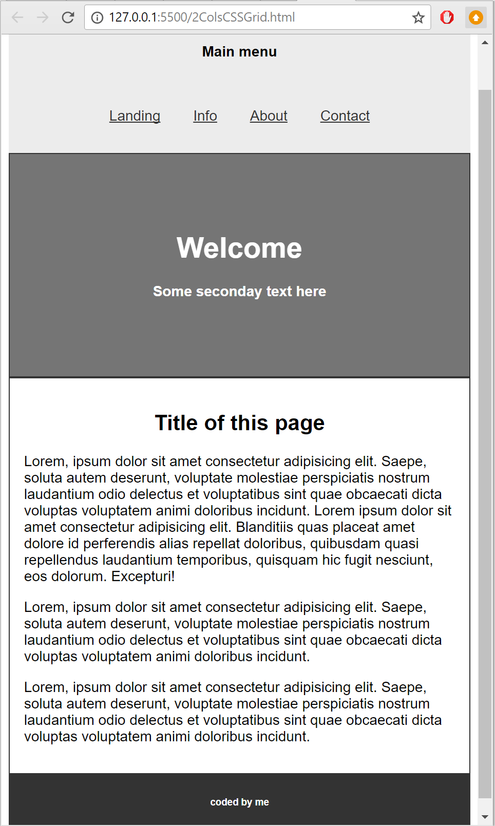
And that's almost it! Now you can ask, how can we make it responsive? Pretty easy, we just have to re-define the grid-template-areas with @media queries. For example:
/*MOBILE PORTRAIT */
@media only screen and (max-width: 600px) {
  .site {
    display: grid;
    grid-template-areas:
      'menu menu'
      'head head'
      'content content'
      'foot foot';
  }
}
As you can see with grid-template-areas we can re arrange the contents as we wish (I moved the menu to the top). With Bootstrap it will not be possible to move the content without modifying the HTML file while with CSS Grid we can do this by just changing a few lines of CSS. This changes everything!
Conclusion
This is just a small example with a couple of properties but CSS Grid has a lot more. You can define the width of the columns with "grid-template-width" using pixels (px), percentages (%) and fractions (fr), or you can include a gap between rows with "grid-row-gap". There is a lot to read.
Of course CSS Grid cannot replace all other components that Bootstrap offers ( navbars, buttons, cards etc..) but to define the structure of the site is pretty powerful. You can even use both at the same time!
I recommend you to have a look to the following articles and videos if you want more info about CSS Grid:
- CSS Grid changes everything - Presentation by Morten Rand-Hendriksen
- W3C Documentation
- Gridbyexample.com - Documentation and multiple examples
You can find all files of the above examples in the following repository in GitLab.
If you have any question, you can contact me on Twitter or send me a message here.
Hope you enjoyed this article.
If you enjoyed this article consider sharing it on social media or buying me a coffee ✌️
Oh! and don't forget to follow me on Twitter where I share tons of dev tips 🤙
Other articles that might help you
my projects
Apart from writing articles in this blog, I spent most of my time working on my personal projects.
theLIFEBOARD.app
theLIFEBOARD is a weekly planner that helps people achieve their goals, create new habits and avoid burnout. It encourages you to plan and review each week so you can easily identify ways to improve your productivity while keeping track of your progress.
Sign up
SolidityTips.com
I'm very interested in blockchain, smart contracts and all the possiblilities chains like Ethereum can bring to the web. SolidityTips is a blog in which I share everything I learn about Solidity and Web3 development.
Check it out if you want to learn Solidity
Quicktalks.io
Quicktalks is a place where indie hackers, makers, creators and entrepreneurs share their knowledge, ideas, lessons learned, failures and tactics they use to build successfull online products and businesses. It'll contain recorded short interviews with indie makers.
Message me to be part of it